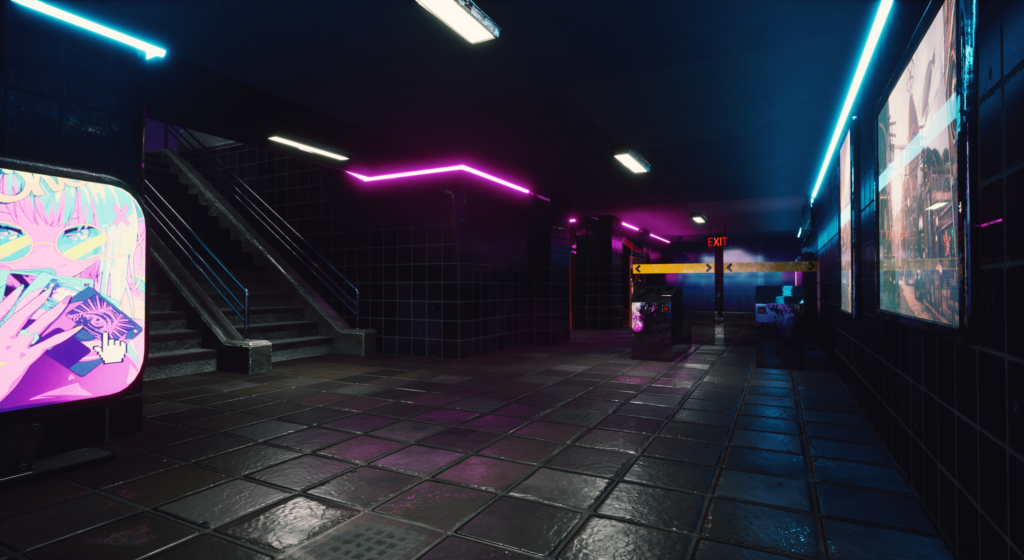
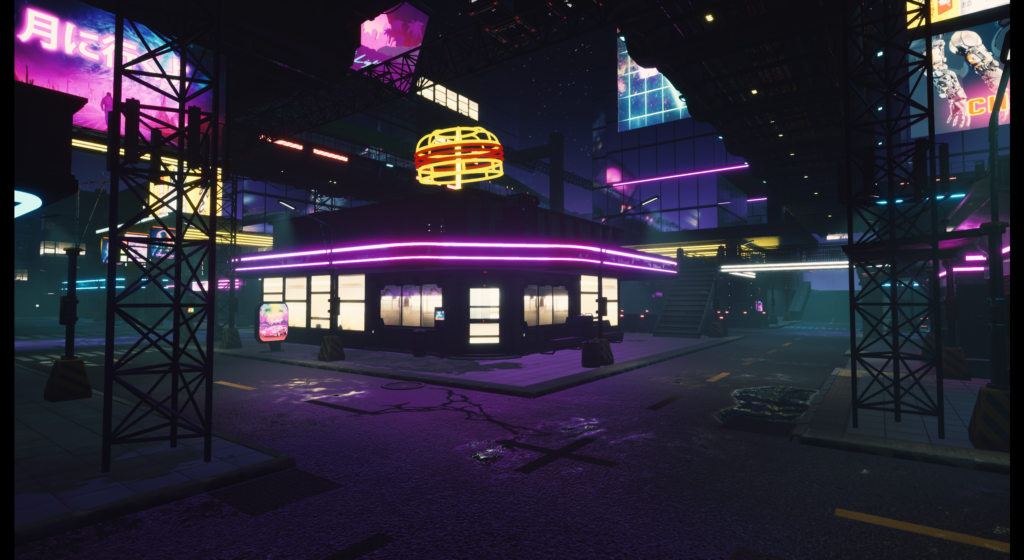
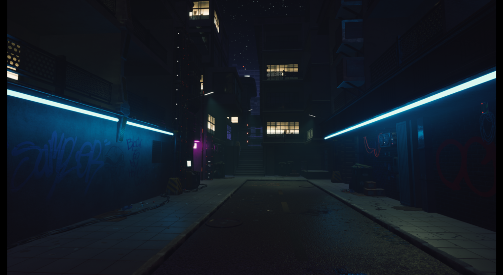
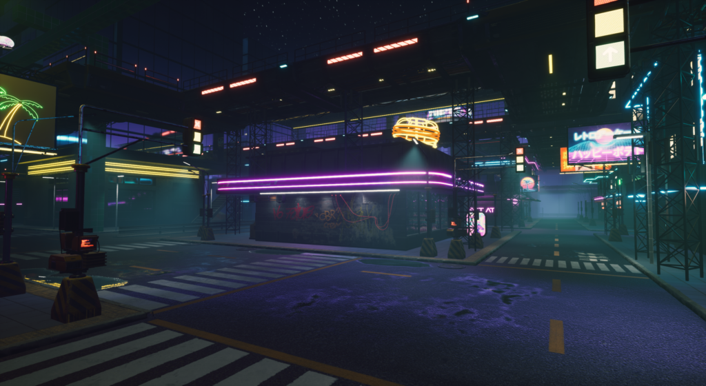
Cyberpunk city was originally thought to be a collaboration with another student, but we realized early that we had to work our own ways in the end. With the release of Cyberpunk 2077 and something I always had in mind that I wanted to do my own version (or vision) of, I thought this was the perfect opportunity to make it real.
- Development time: 6 weeks (4h/day)
- Focus: Worldbuilding and environment design
- Tools: Unreal Engine 4.26, Maya, Photoshop
Planning
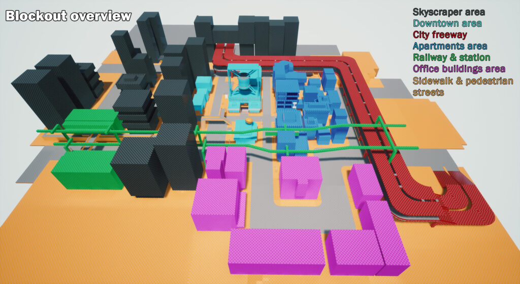
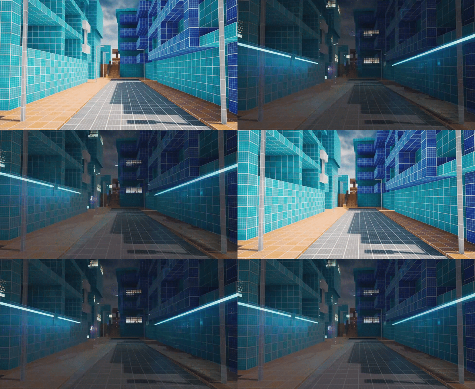
I began with a simple blockout, to space plan the areas around the center of my city and the structure around it. I layed out a foundation for the roads and sidewalks, so I could measure the overall size for the buildings. Generally in the cyberpunk genre they have huge skyscrapers and tall apartments, but after some testing I desided to make the area compact and inferior. I worked out from the central part of the city with the normal sized buildings and started to frame the environment around me with taller buildings around, the farther away from the center they were. From a first person perspective I started to walk around the streets to verify that the scale looked appropriate.
I looked at reference images from other people’s work to envision what identified a cyberpunk city and added those parts to my blockout.
Lighting the environment

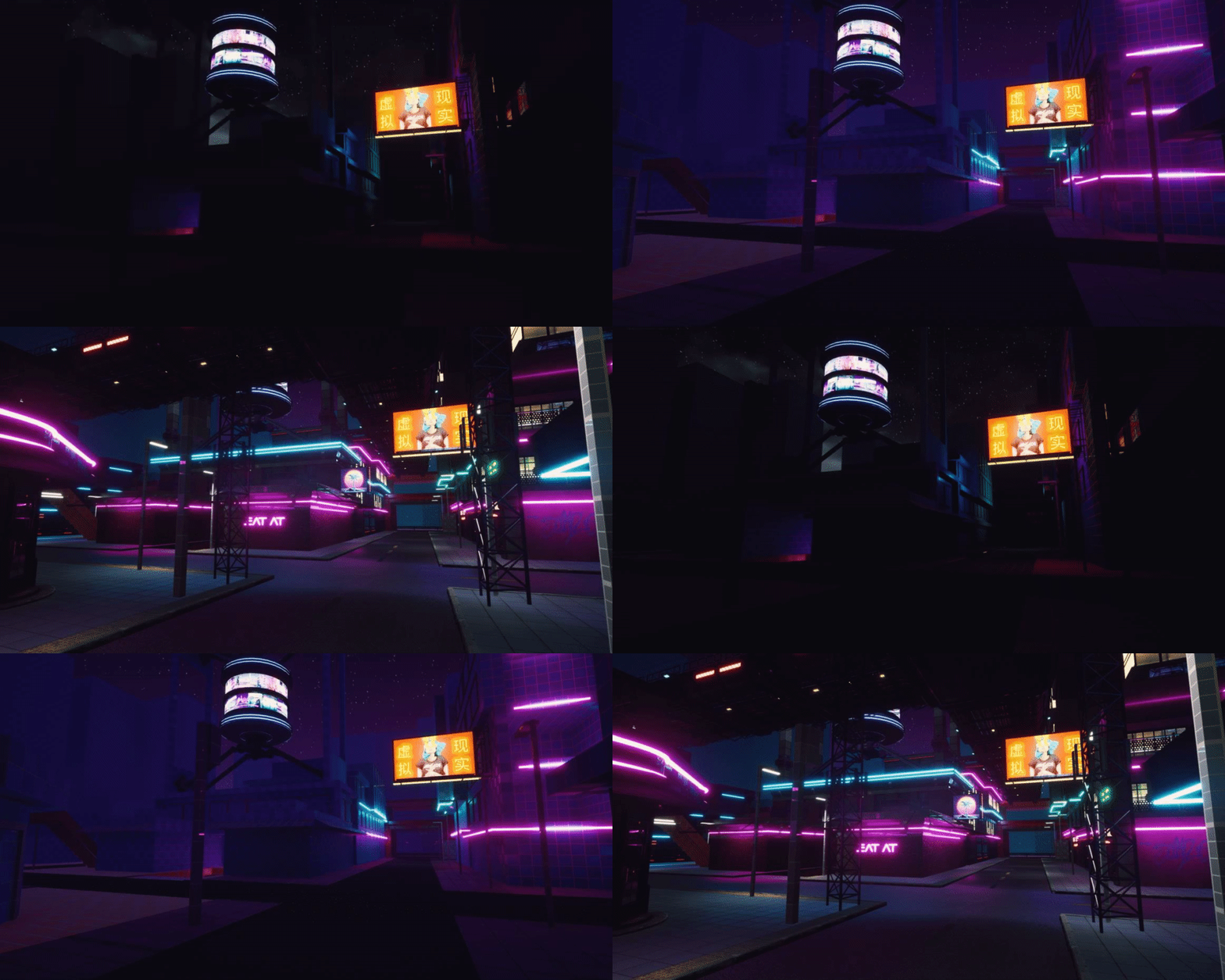
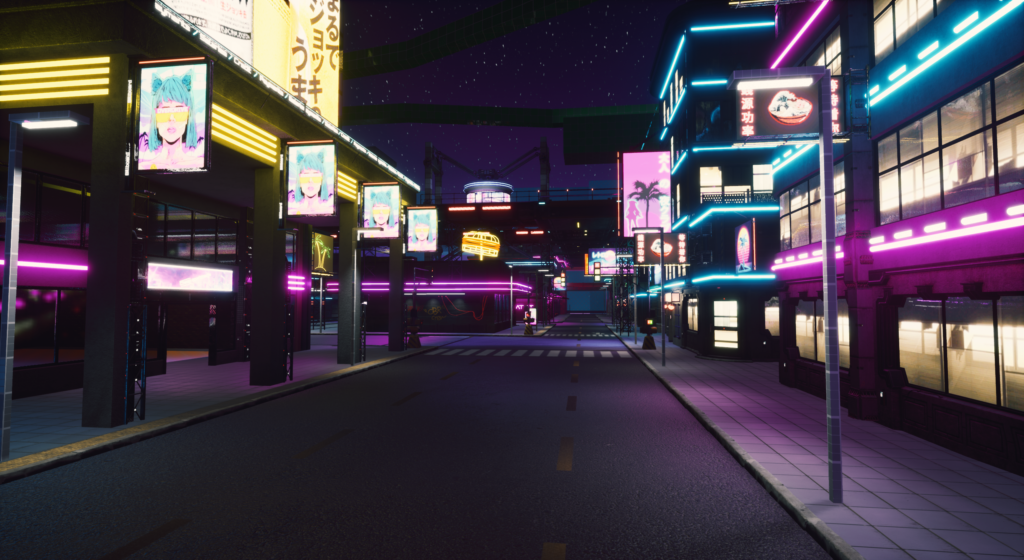
I knew from the start that I wanted to have this project take place during the night, I had to set up the lighting in the city before I moved on to construct the buildings together. When the blockout was done, I began to experiment with emissive lights that would work as neon lights and the scenes overall environment light. I created a copy of my blockout scene and removed all lights in it and from there I set up all lighting from scratch. I wanted the environment to be very reflective so I had to add in reflections captures to make them strengthen the lighting as whole in the city. I realized very fast that the neon lights could not be the only main source of light in the city, so I added a bunch of directional lights that would match the color palette that I had set up for my scene.
Constructing the city
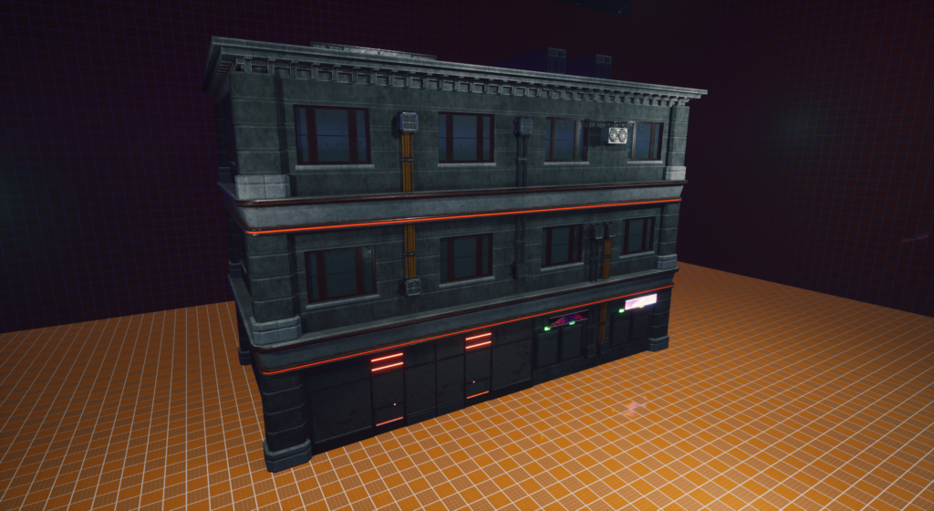
With the simple lighting set, I continued to construct the set dressing for my city environment. As I was unfamiliar with the asset package I was going to use, I had to try to combine the building pieces together to create the correct size of the blockout. Once I got the hand of how things were puzzled together, I worked my way through my blockout and added assets over it.
My goal here was to get a variety in the overall architecture, so that all buildings felt unique in their own way. With a big variation in the walls and windows, made it easy to follow the design I had constructed in my blockout.
Working with details
- Props. Finding a balance in the right amount of props is always hard and feels like you can work for weeks with just adding in them to enhance the environment. But working with props in an environment like this is really essential to get the feeling I was looking for in my city. As I had a small amount of props to work with, I had to do my best to get what I had in mind from the start.
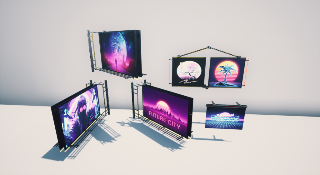
- Emissive signs. When I think of a cyberpunk or dystopian futuristic environment, I immediately think of big advertisement and propaganda signs and billboards in the city. This was something I wanted to have in my scene as well to get the feeling I was aiming for. To get a bigger variation than the once I already had, I utilized the already UV mapped textures for the propaganda signs I got from an asset package, to easily create new ones in Photoshop.
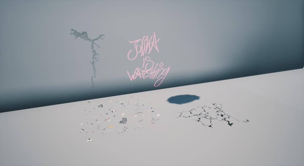
- Decals. This was the final touch that like props is something you can work with forever to polish your scene to make it even better. The majority of decals I used for my environment was to make the streets and roads feel damaged and worn out. Cracks and garbage lying around to get the feeling that no one cares about the city’s appearance. Graffiti decals was also one that really put the nail in the coffin for the environment. The hard part working with these was to make sure you could actually see them in the dark environment. Therefore I had to make some changes in my overall lighting of the city.
